The past few weeks we’ve been working on the next generation of theming for Rubin’s user documentation. Although the work isn’t done yet, we wanted to make sure everyone’s in the loop and that you have a chance to provide feedback.
The documentation for the new theme (which is also using the new theme!) is at User guides — Documenteer
Features
Some of the key features:
- Based on PyData Sphinx Theme, which gives us features like light and dark modes, responsive design, multi-level navigation, and more. Branded for Rubin.
- TOML-based configuration file as a clean abstraction over Sphinx conf.py files (though you can still hack the conf.py file if need be).
- Automatic metadata configuration for Python projects using pyproject.toml.
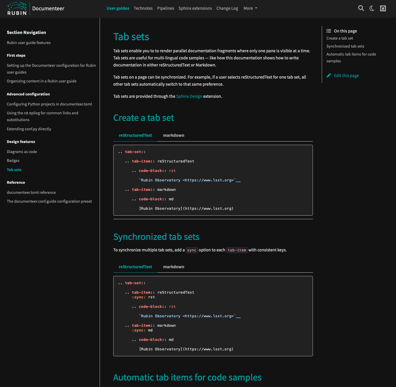
- Lots of design features, like badges and tabs for multi-lingual code samples.
- Markdown is fully supported as a source format, along with reStructuredText, thanks to the MyST parser.
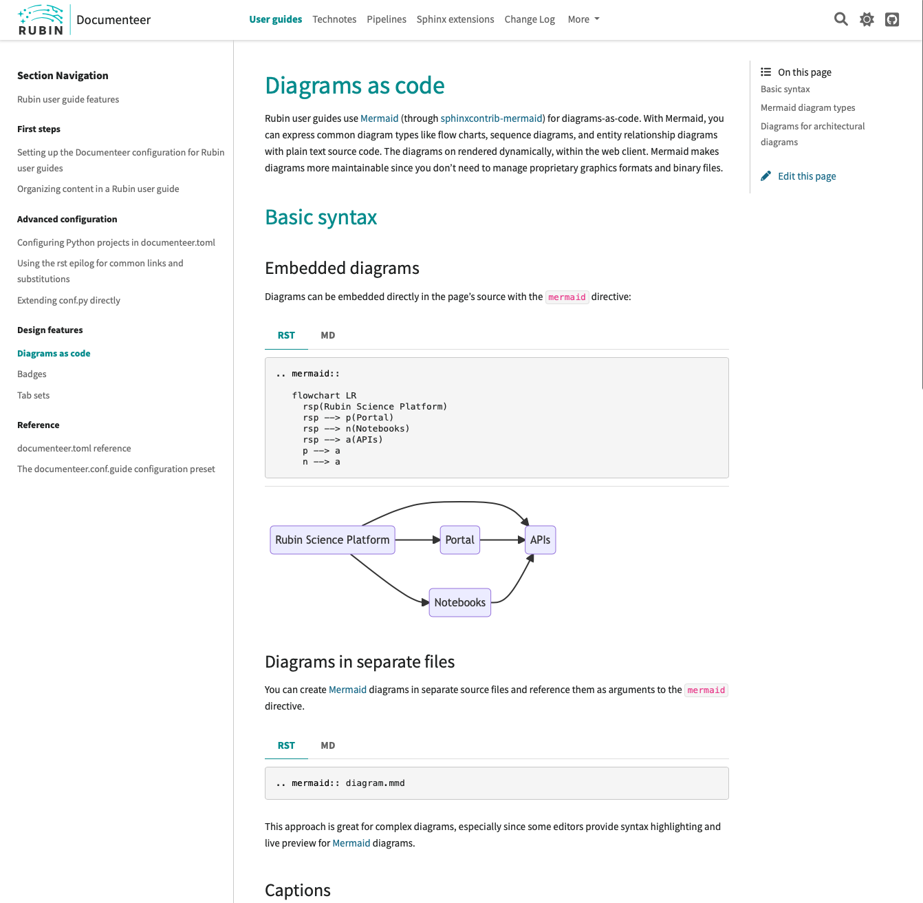
- Mermaid for diagrams-as-code.
- Links to edit on GitHub are back.
- All of Documenteer’s Sphinx extensions, as usual.
Where this theme will be used, and where it won’t be used yet
This Sphinx configuration can be used for nearly (*) all of Rubin’s user documentation sites. So everything from Data Release/Data Preview and Rubin Science Platform documentation sites, to our beloved Developer Guide, to all the user guides we create for specific services and software projects.
This theme won’t be used for technical notes, although that’s coming soon after too. The technical note theme/configuration will work and look a lot like our user documentation theme, but it’ll be tailored to the specific needs and format of technotes.
On day 1 this theme won’t be used for the LSST Science Pipelines, though that’ll very much be the second phase of the rollout. The LSST Science Pipelines have some specific build and configuration needs. But the Pipeline’s documentation will look just like our other user guides.
Roll out
In the next week or two, I’ll put the finishing details on the first release of the theme configuration, and incorporate your feedback as well. We’ll also start slowly rolling the theme out to various SQuaRE projects.
Once we make a full Documenteer release with the new theme release, it’ll be time to roll out the theme to the rest of our documentation projects. I’m hoping that each team will be able to upgrade their own projects, though I’ll be available for help in pull requests and in dm-docs-support on Slack. Frossie has also suggested we could arrange a Zoom session where you could work on updating your project to the new theme and you can get advice in real-time.
I’ll add that adopting the theme and configuration is quite easy — we’ve worked hard on the configuration experience. What might be challenging, but also quite fruitful, for many projects is arranging your documentation’s toctrees to make the best use of the theme’s navigational structure. I’ve written a documentation page on tips for doing this.
Let me know in the comments if a Zoom session would be useful and I can organize it. Lastly, you can try out the theme now (caveat emptor) by installing a beta release of documenteer[guide] 0.7 from PyPI and following the docs.
Let me know what you think, what questions you have, and what features you’d like to see added in the comments below. Thanks!