Hello. I followed today the survey strategy visualization discussion at the RCW 2025. I wanted to put here for comment a few suggestions for your consideration:
Add RA/DEC to the celestial sphere visualizations in ls.st/svnightly summaries.
In https://survey-strategy.lsst.io/ (great resource!):
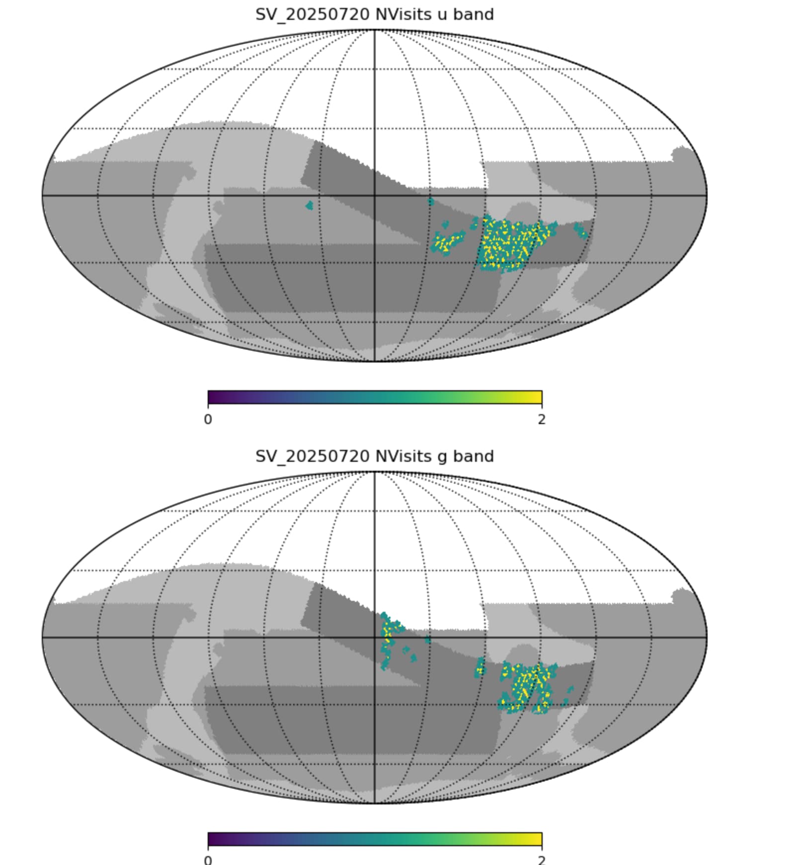
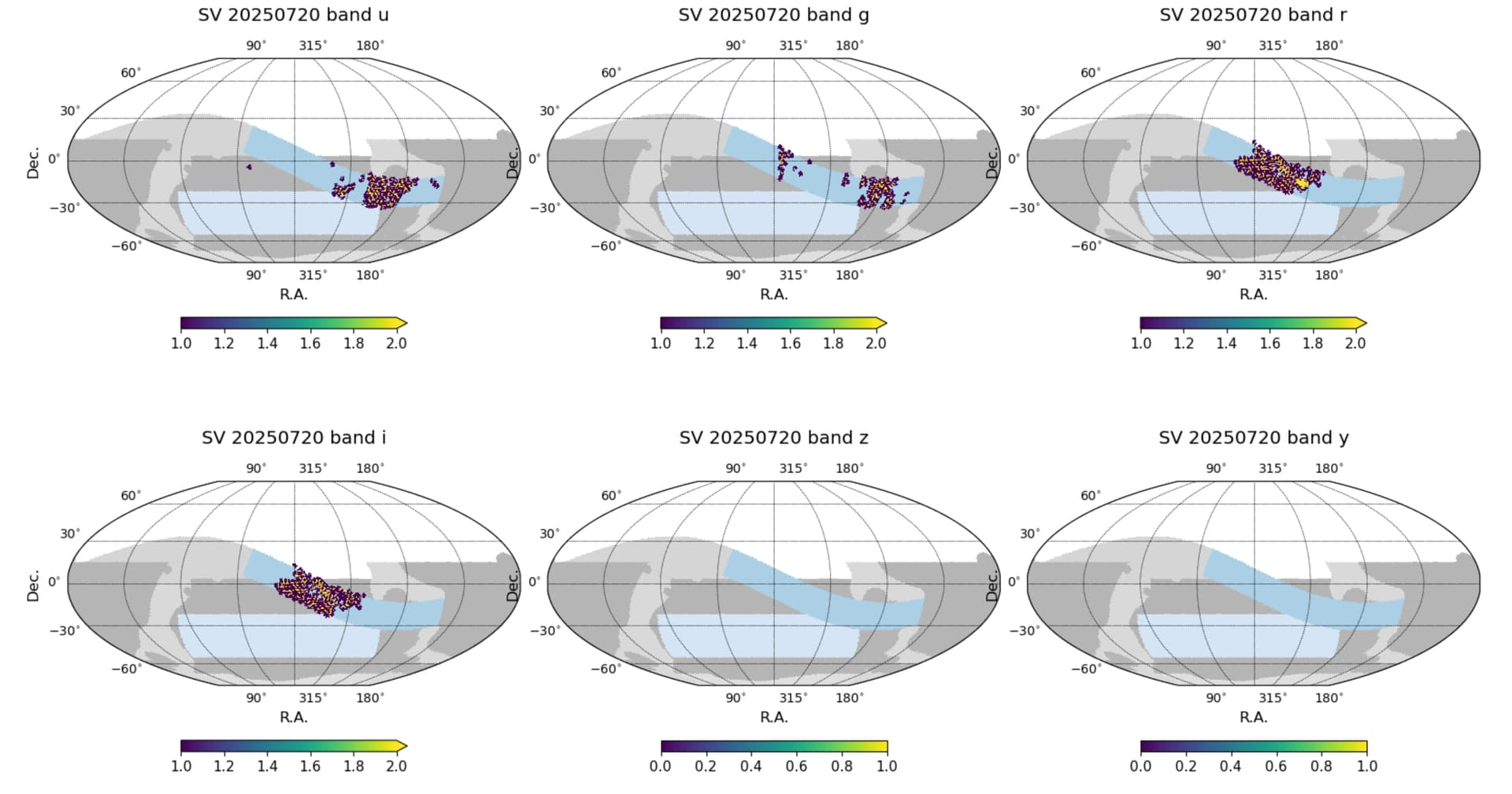
*** Together with the static maps of number of visit progress, add a histogram to see the average and spread of number of visits more clearly. Helps get a clear idea of the depth and homogeneity quicker.
*** Fold in to the number of visits (or in addition to) the t_effective quantity or something like that adding a weight considering seeing, sky brightness… In my view this produces a more nuanced view of what has been accomplished so far with data quality considerations.
I’m trying to keep the total plots and reports on the survey-strategy pages down (to reduce the confusion and overload like Meg pointed out) so will make the histograms and see how they look — we generate these in maf all the time but people don’t seem to refer to them often so it’s not obvious how useful they are in practice. We could definitely add them onto the nightly progress reports pages (coming very soon), which are intended to be a little more comprehensive.
The teff would be easy to add to the table though … would you really prefer median teff or median coadded depth in magnitudes? (or maybe both)
(Assuming I reference t eff to current predicted values at dark sky /zenith).
Thanks, I understand completely, whatever you guys think is more appropriate. Interesting question… I personally like t_eff, but I think most people would actually prefer depth, so I leave it up to you! Or both if it doesn’t saturate too much.
Rather than starting a new thread, I thought I would jump into the discussion started with the feedback on the survey-strategy survey progress page. I like the survey-strategy pages because they are stripped down and accessible. I think if they had a bit more information or plots it would make them what the community would want and then there could be links to the nightly report.
I don’t know what I’m looking at in terms of whether this is what’s been taken or whether it’s what’s been taken+what’s predicted (and then I reread the capture a bunch of time to figure it out each time I go to those pages).
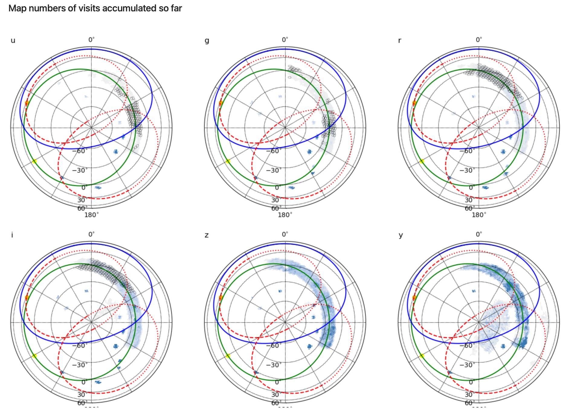
I think it would be help, if there was a plot like the first plot on the sky-coverage page but just what was taken the night before) - I find the project confusing on the more detailed maps (I get why it’s useful for people in operations but I think other astronomers are used to the projection on the sky-coverage website).
I would also love one sky plot of just here’s everything taken to date in terms of sky coverage, and then here’s the projection forward if that’s needed (maybe that should be it’s own page where the plot gets updated daily rather than in each nightly report on the survey-strategy website).
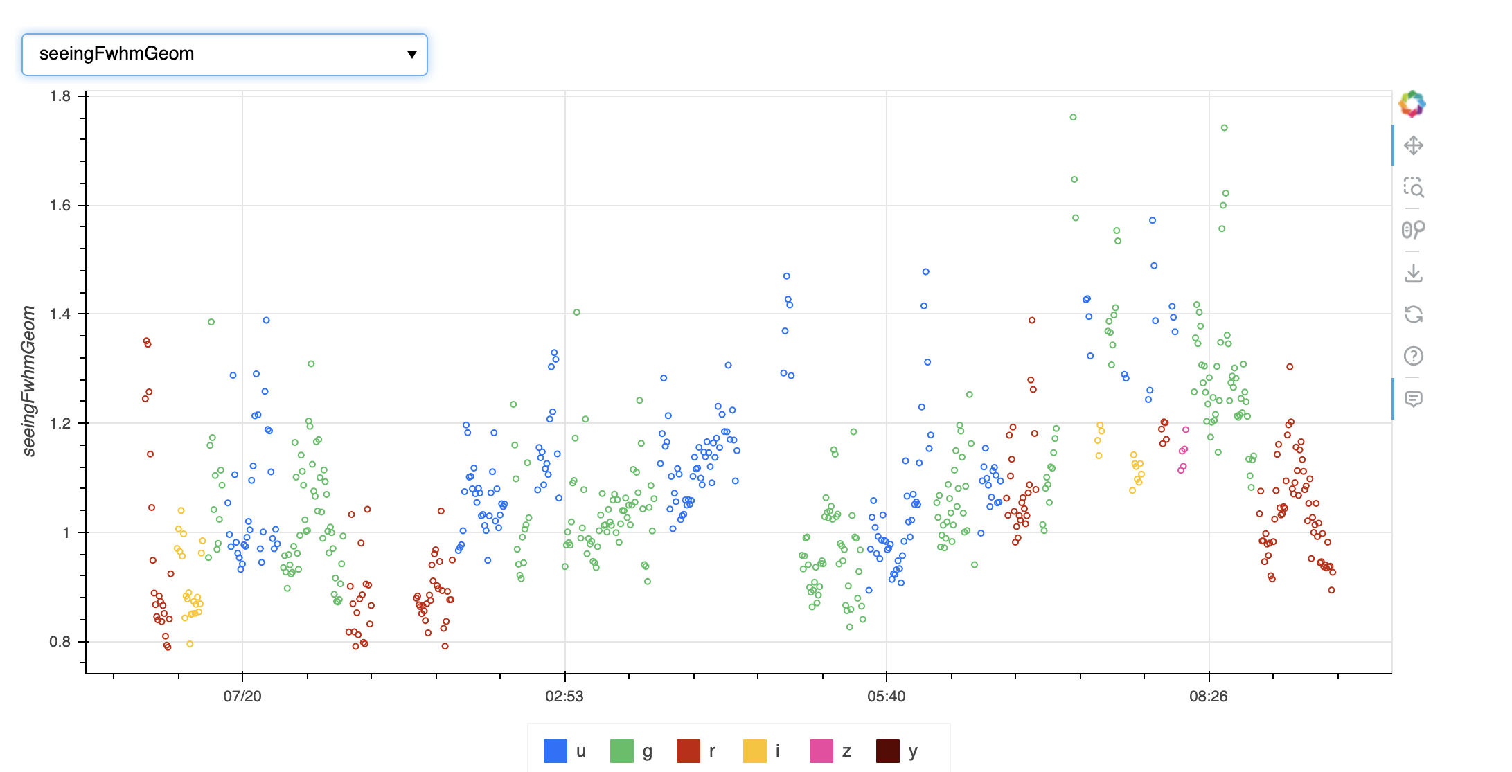
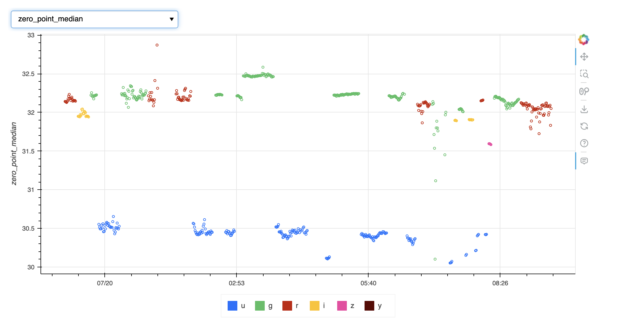
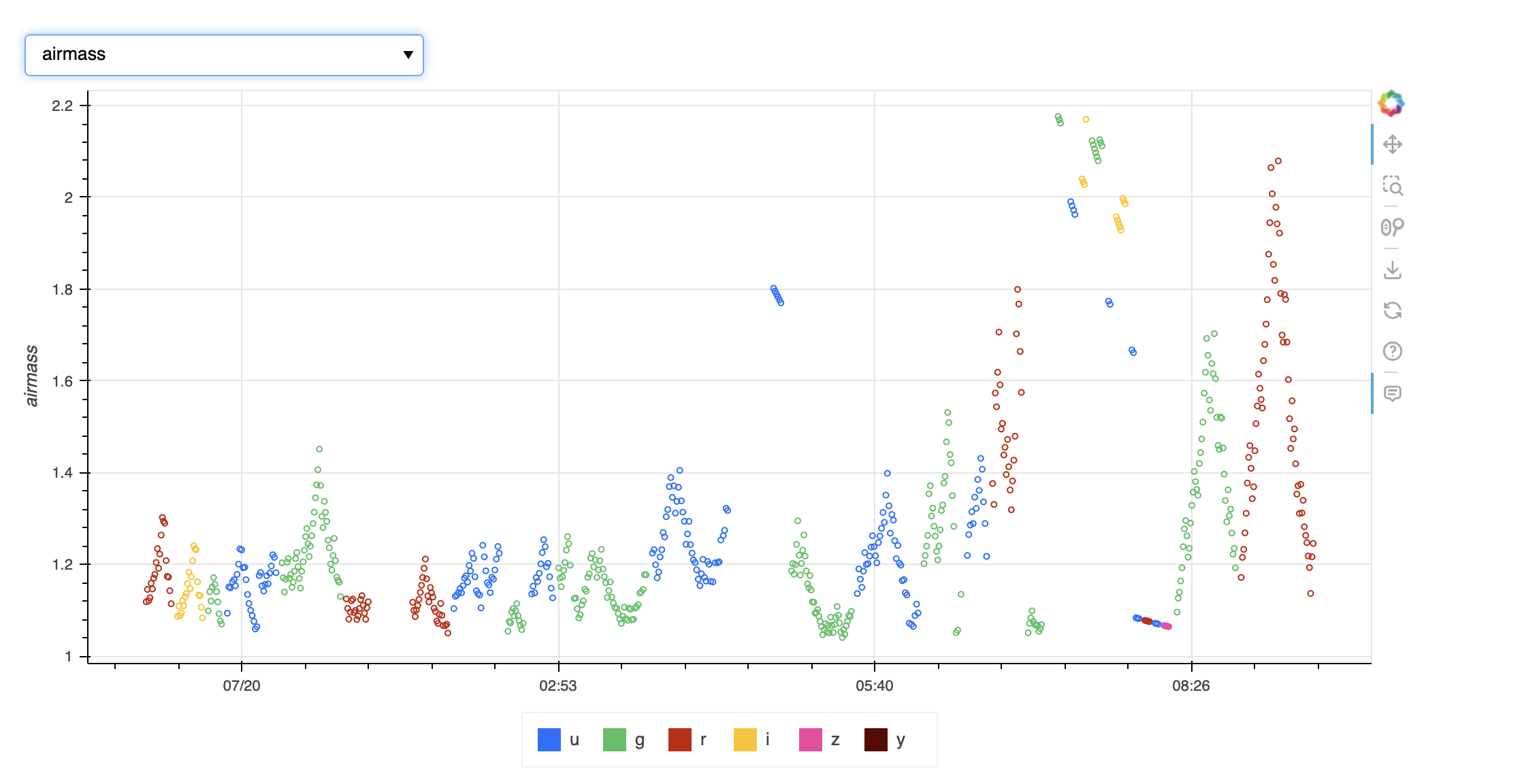
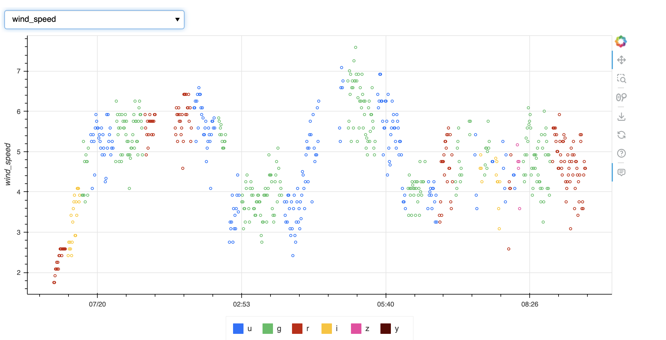
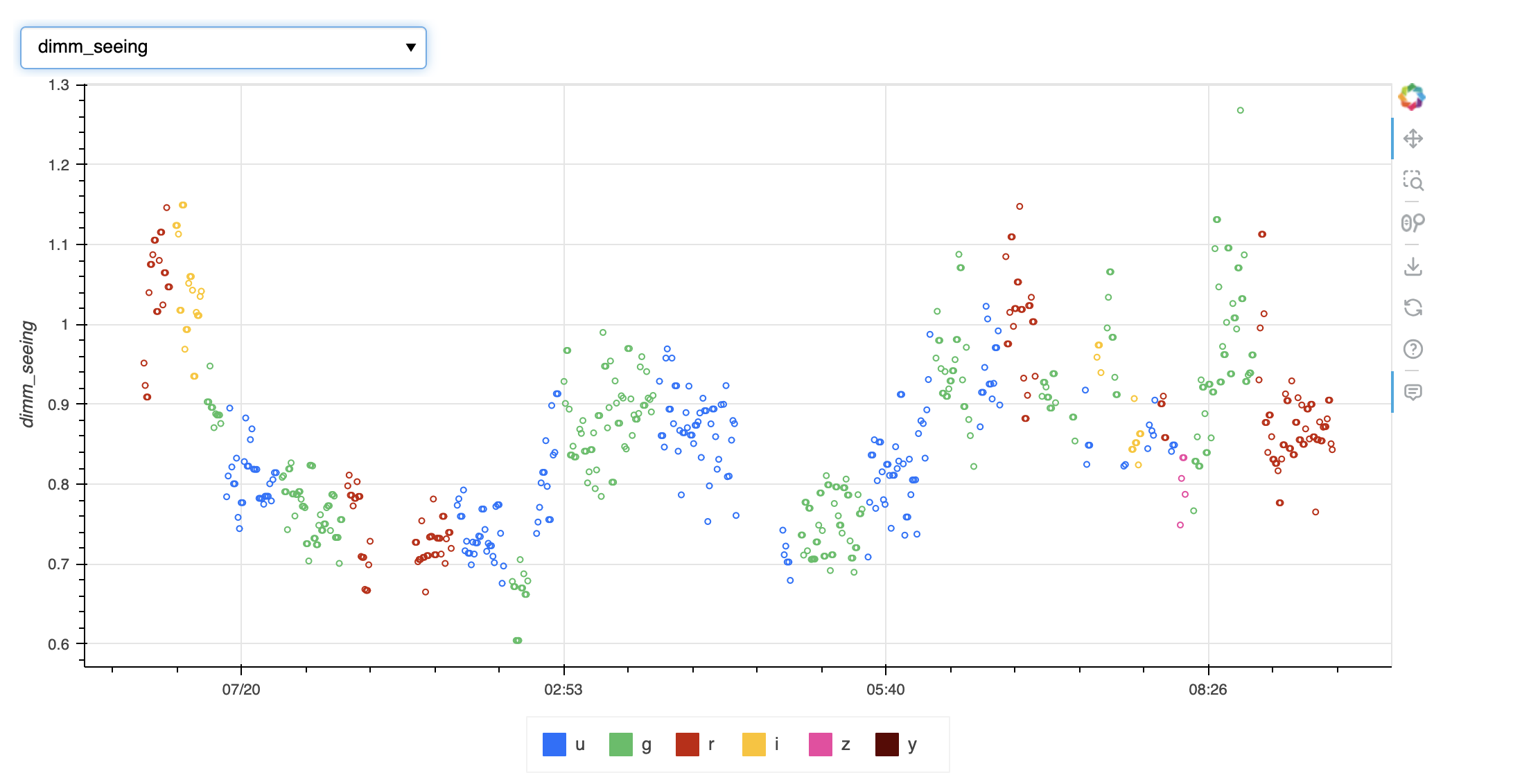
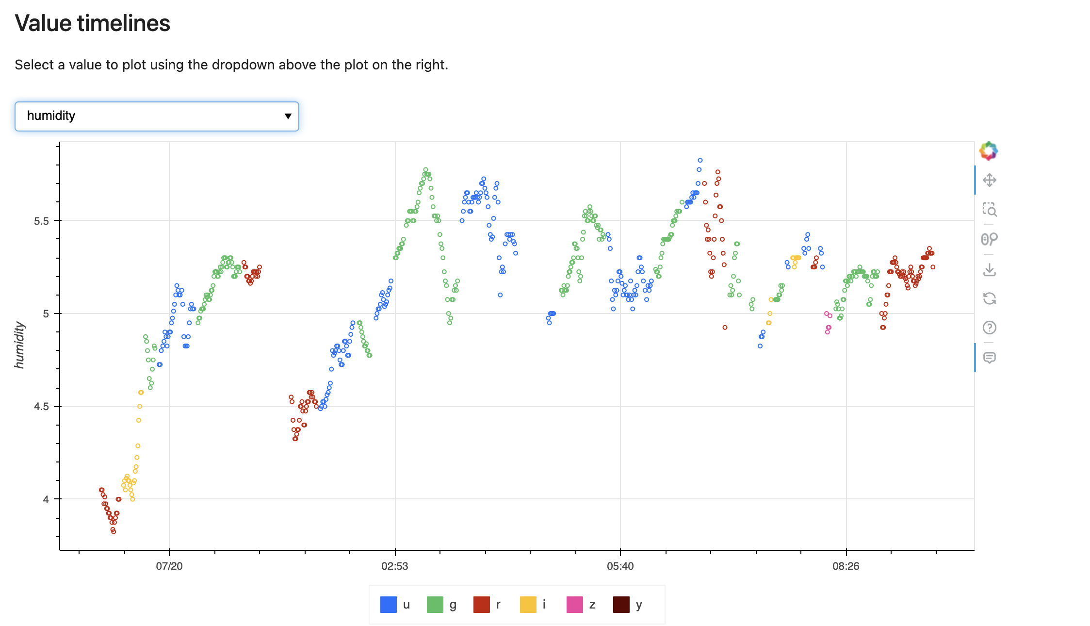
It’s hard to get context if no observations/the survey performance not being the same as predictions because of the usual things that could impact it (weather, observations conditions, etc) - if it could be report the number for how usable hours in the night, and the fraction of open camera shutter time, a metric for nightly pairs (I believe in MAF there are ones for fraction of observations in nightly pairs or something similar)that would help get a sense of what happened/what’s impacting progress, a plot of the seeing and plot of zeropoints would gave most astronomers enough to figure out what happened like clouds or bad seeing I get that all these plots are perhaps overwhelming but direct links to them in the more detail report would help if it’s too much on a single webpage.
Thanks Meg - I think continuing this thread for now seems like a good idea.
I think it’s clear that feedback from more people looking at the pages is helpful!
I’m maybe getting a little confused myself about which pages you’re discussing however – can we maybe for now call
the pages at ls.st/svnightly (here’s an example from a night which had data - nightsum_2025-07-20) the daily public nightsum report and
I will make the text on the survey-strategy weekly update pages more clear. The sky plots there are only include observations to-date and do not include the expected coverage to end of survey.
I’m not quite sure, @mschwamb, if you’re asking for a plot of the previous night’s coverage (only) on the weekly progress pages, but I would think probably not? So you mean maybe on the daily public nightsum?
is intended to provide that information, but I think you’re saying … given that you’re used to different projections, and perhaps because these plots themselves are a bit busy - that you’re not getting the high-level view you can digest. So maybe something like:
And yes, on the nightly reports - it makes a lot of sense to report the available night hours and the hours the SV survey ran … and then the open-shutter fraction within the hours the SV survey was running.
This leaves the question of what happened outside those hours up in the air (we could look at reporting open dome hours?) but the question of other tests being run during commissioning is maybe a bit too wide-ranging for us to easily convey with what we have here. (it is on the list for the nightly digest tool though, but that’s not publicly accessible yet anyway).
The seeing and zeropoints are available in the bokeh plot in the middle of the nightly report at the “Value Timelines” section (the clouds are not, but we’ll get that into the list of things you can select).
This points out we should probably have links to jump to these different sections …
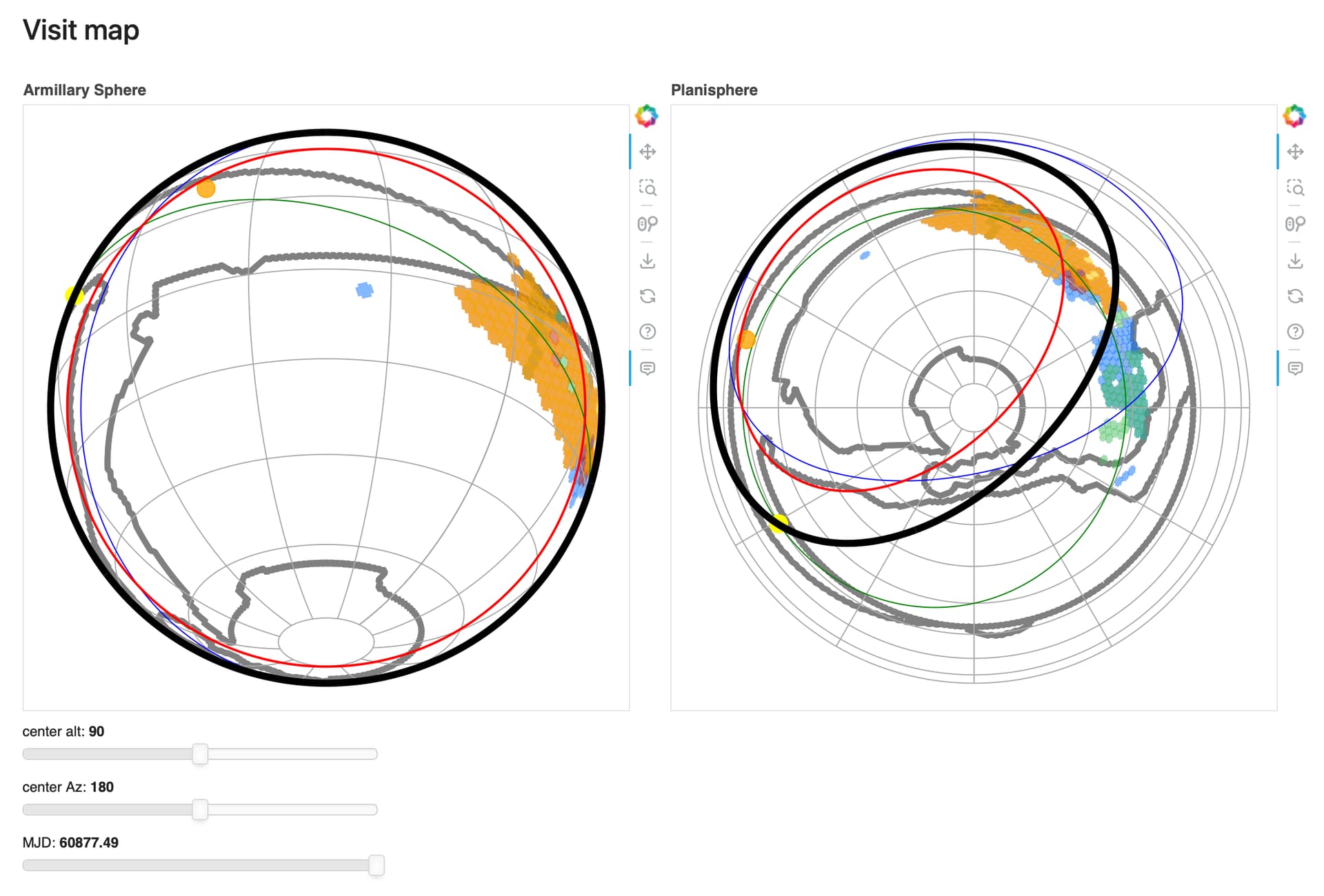
Yes, yes, and yes =- I understand way more what’s going on in the regular cadence RA/Dec plots you made compared to the Armillary sphere and Planisphere orientations. I get why they’re useful for the Operations/Commissioning team, but I would strongly encourage having those as additions to the daily public nightsum report .
I would argue not to worry about what’s happening in SV and more in operations - which could be easily reporting hours in the night, hours the dome was open, hours of engineering + fault, hours of science observation, hours lost to weather - at Gemini North (when I worked there) there was a script that tallied up the Jira tickets for faults and we manually added up the engineering time and put them in the nightly log file. This was to track performance/down-time trends. I would assume similar stats will be recorded for Rubin in full Operations. For now, it could be anything that’s not SV time when the dome is open be deemed engineering for simplicity and then calculate the full stats in science operations.
Personally I would make a " last night page" aka the missing daily progress update that’s updated for the science community daily that is a paired down version of the daily public nightsum report - with the information that’s most digestible to the community that gets overwritten at some time. 10am Chilean time or something like that.
I look at the current status of Gemini North page (there is one for the South and these are uploaded in realtime) and it has the minimum information available (although to get a deeper look I may need to open one of then figures in a separate tab). This plays on the giant screens in the control centers/operations room.
My suggestion for splitting is then the the nightsum report is for the operations team/observatory and the public facing daily progress update page (last night page) provides the digestible basics for the “users”. You still bring us along but you’ve made it user friendly. So include those sky projections of coverage as we expect to see it from the last night and these below plots (or similar ones that one after the other together tell us what happened). Then if someone wants to go deeper they can with a link to the nightsum page which is for operations so dear reader figure it out yourself.
Plus if there was a plot for cloud cover. Comparing and contrasting the plots is helpful (personally)
And adding in a table that gives the status for reporting hours in the night, hours the dome was open, hours of engineering + fault, hours of science observation, hours lost to weather (which I also think should go on the weekly updates too).
I would also argue that in full Science Operations a version of Keith’s weekly reports (daily would be great if it was also included on the daily progress update but I might be pushing my luck) and be in the weekly updates ( always positive thinking/perspective short overview of the night) - queue observer had to write the high level summary at Gemini North each night. I imagine that being very useful. I’m thinking this high level:
Sunday -closed due to ice on the dome
Monday - excellent conditions - we executed survey observations all night.
Tuesday - there was a dome fault at the start of the night which we recovered from quickly and then observed for most of the night including executing a GW TOO
Wednesday - AOS system engineering tests in twilight, LSST observations for the rest of the night
Thursday - Executed survey observations until Midnight. High humidity and rain prevented the dome opening for the rest of the night.
Friday - Photometric conditions and great seeing. The telescope and scheduler performed well.
Saturday - Beautiful moonless night. Systems performed flawlessly. LSST observations grizy.