Hi folks, thanks so much for making the simulated solar system objects and DP0.3 available. As a first time user of the RSP, I tried the tutorial to use the MPCORB table (dp03_catalogs_10yr.MPCORB) through the TAP service. Using the suggested cut of H<20 produced me a table of the 50,000 (limit) objects as expected. However it seemed that the semi-major (‘a’) column which I would expect and which should be there according to Table 4/page 31 of the DPDD, is missing and is also missing in the schema browser. Can do the remedial orbital elements math and reconstruct it from the other parameters but this seems like it should be there… ?
Ta muchly,
Tim
1 Like
Hi Tim, it’s true that the DP0.3 data set did not come with a pre-computed semi-major axis (a), and that users have to derive this for themselves using the orbit’s ellipticiy (e) and perihelion distance (q), as a = q /(1 - e).
Your comment made me realize that the beginner-level introductory DP0.3 tutorials for the Notebook and Portal Aspect don’t cover this conversion. (They’re the only tutorials available so far, and don’t happen to use semi-major axis; but it is covered in a few of the intermediate-level tutorials, coming soon).
Furthermore our DP0.3 data products definitions document doesn’t mention this conversion either – I’ll get it added. Thank you!
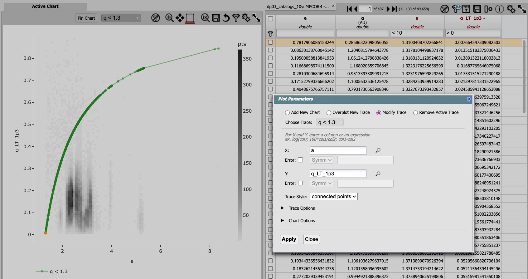
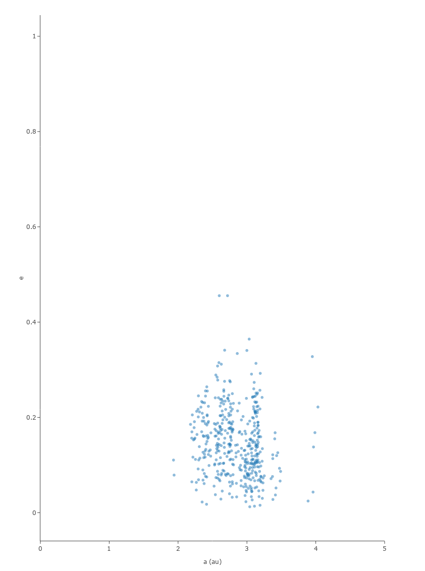
Thank you for the quick response @MelissaGraham I added another column to the table with the formula and that’s working for me now and I could produce the classical a vs e plot:
Now I need to figure out how to overlay the NEO q<1.3 curve…
The need to compute a was indeed not mentioned in the tutorials or the dp0.3 definitions document as I checked there first in case I was missing something; I also checked the “unpopulated fields” section
If you’re working in the Portal aspect, I can think of a way to hack plot a q<1.3 curve – but it’s better to use the Notebook aspect for making plots like that.
The hack.
The hack is to create a new column of values equal to 1 - 1.3/a, and overplot a new trace that is those values vs. a. It will appear as a q<1.3 curve as a line so long as the trace style is “connected points” and the “q_LT_1p3” column is sorted. Note that the “Plot a Function” tool is on the long-term list of functionality to be added.