With the completion of DM-20556 and DM-24348, I’m pleased to share some new plotting tools to help analyze the results from running the AP Pipeline.
A Jupyter Notebook showcasing the plots and how to make them is in the ap_pipe-notebooks repository on GitHub.
These plotting tools may be useful if:
- You have an Alert Production Database (APDB), produced from running ap_association after image differencing
- You want to visualize the locations of DIA Objects and/or DIA Sources on the sky
- You want to learn how many constituent DIA Sources a typical DIA Object has
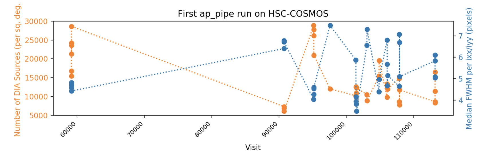
- You want to see at-a-glance when and under what conditions the observations comprising a dataset were taken
The plotting tools work for both DECam and HSC, and the demo notebook includes example plots for both. The scientific quality of either dataset used to showcase the plots is not guaranteed 
Thanks to @yusra for writing “starter code” for some of these plots, to @isullivan for being a beta tester for some of the others, and to @sophiereed for reviewing.
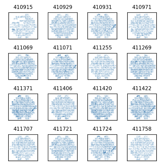
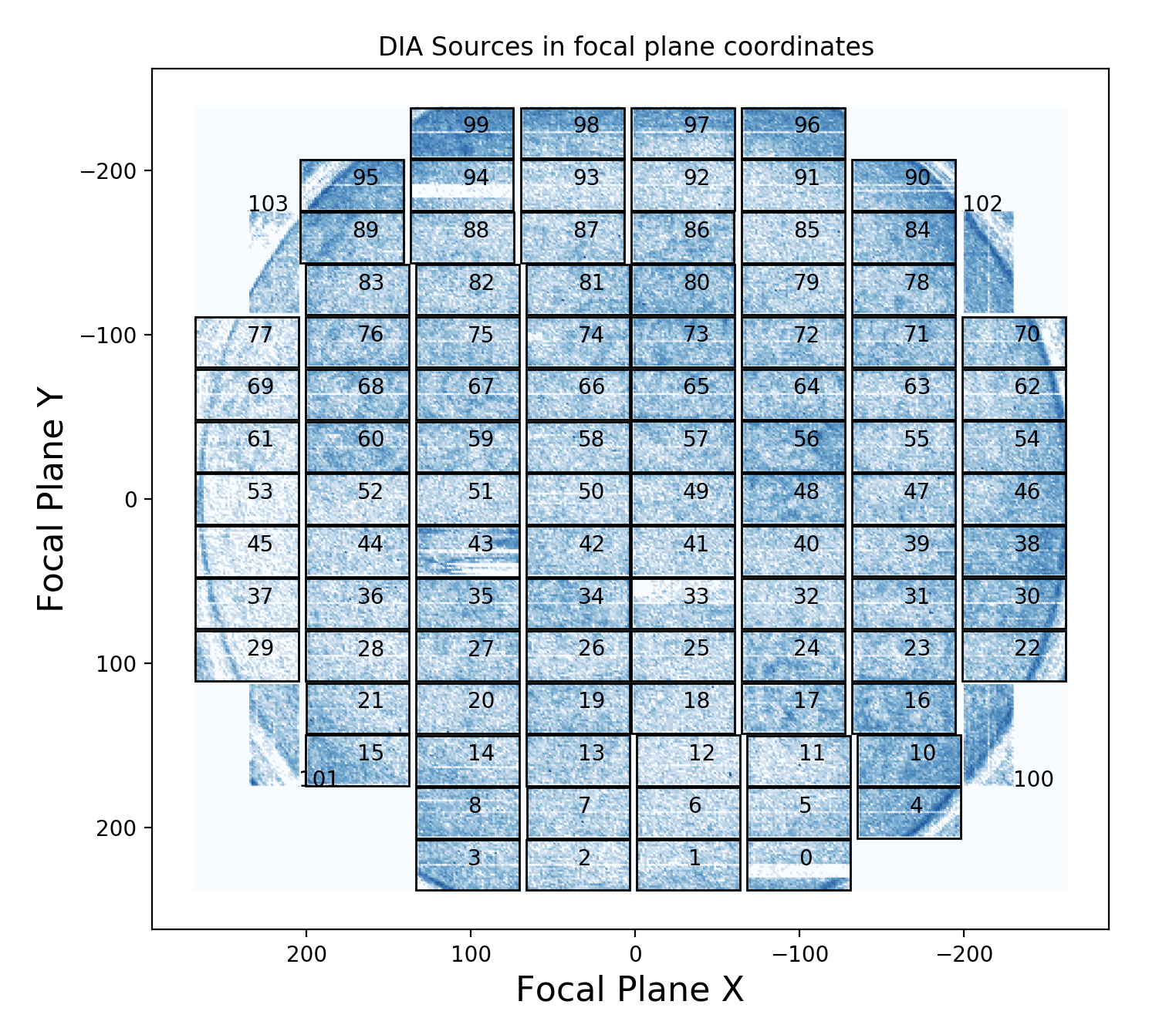
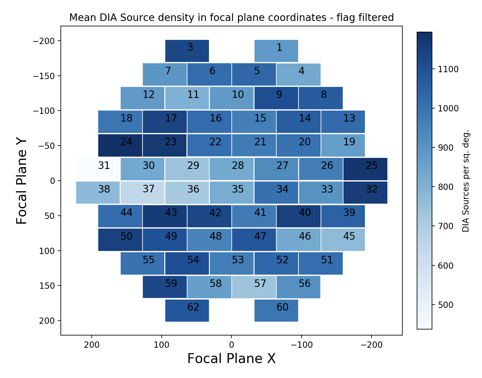
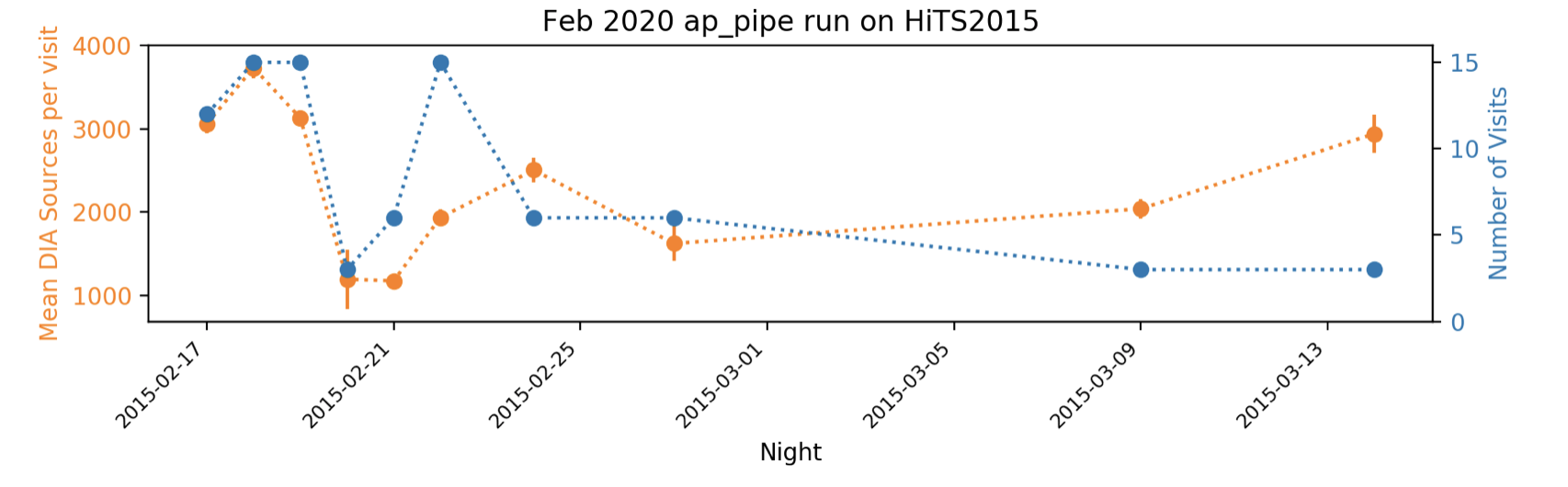
Below, I include a few representative plots so you don’t have to click through to a notebook to see them.