As part of the Community Engagement Team’s efforts to improve this forum, we propose the addition of a banner that is always visible at the top of the screen. This will not only improve the aesthetics of the forum, but will make it easier for new visitors (or those who haven’t visited for a long time) to quickly understand the purpose of the site, and to readily navigate to frequently visited topics on the forum, and related external resources. An example of the type of banner we are considering can be seen at this Unbounce forum – notice that the banner can be expanded or collapsed by clicking on the button at the top.
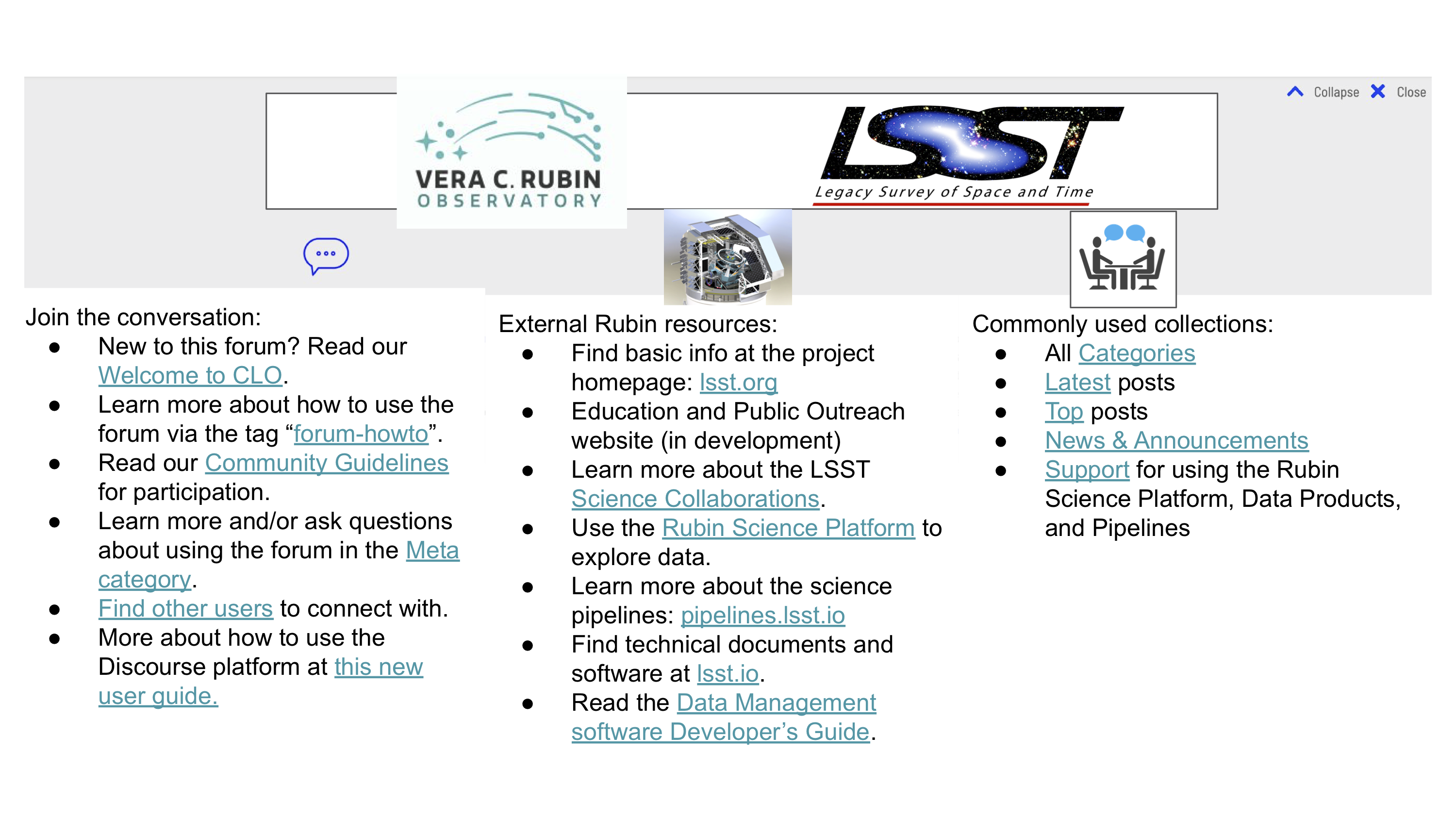
Once we have decided on the content to include in a banner, we will have our fantastic graphic art wizards create something aesthetically pleasing and in keeping with the Rubin visual style. In the meantime, I have created (and attached) a mock-up to promote discussion. Try not to get distracted by the visual elements – the purpose of this mock-up is to gather feedback about the contents that we would want to have in the three columns below the logos/images (or whether we want/need three columns, or two, or eight).
In the current mock-up, the left column is meant to provide resources to unfamiliar users to find help related to using the forum itself. The middle column links to external Rubin Obs. resources. The right column provides links to commonly-used collections of topics as a convenience for navigation.
Before we proceed to the final design – do you have thoughts about the proposed contents of a navigational banner for this forum? [NOTE: the links are clickable in the attached PDF (but not in the PNG that you see previewed in this topic).]
Hey @jeffcarlin, great idea, I think this concept can be useful. Some feedback:
Please don’t refer to the Community Forum as “CLO.” The URL-based acronym isn’t officially used and using the name or full domain (community.lsst.org) is more useful.
Having the "disclaimer"at the top of each page was (at the time we launched the forum) a requirement. We should verify that it still is, and if so, ensure that it is designed into this new element.
I think the “Commonly used collections” column should go directly beside the “Join the conversation column” on the basis of the proximity design principle.
Perhaps the “External Rubin resources” column could use a friendlier title? Like “More Rubin Observatory resources” ?
I’m not sure the DM Developer Guide should belong on the list of links since it has a fairly limited audience (DM) and www.lsst.io is already linked.
For consistency, maybe drop the “lsst.io” and “pipelines.lsst.io” URLs from those bullet points to create something like:
Disclaimer – I hadn’t noticed but the unbounce.com example doesn’t have a disclaimer, and I can’t find any mention in meta.discourse.com of it being mandatory. The fact that meta.discourse.org doesn’t have one makes me think they’re not mandatory anymore… oh, unless, @jsick, was the requirement imposed by Rubin Observatory and not Discourse? Either way it’s probably good to keep; @jeffcarlin can you build the disclaimer into your mock up?
Suggest to rename left-most menu “Forum User Resources”. , and potentially reorder the contents to:
Welcome
Guidelines
Discourse new user guide
Meta category
‘forum-howto’
user lists
I agree with @jsick’s proposal to move “Commonly Used Collections” to the center. And I suggest maybe renaming that one “Join the Conversations”?
The first link to “All Categories” is to the homepage, but I think that would be unnecessary, since a homepage link will always be available at top left?
In attempting to reword the “Support” bullet I found it kind of awkward because there are three places where we offer Q&A, and maybe this will change as we review categories, but maybe we could do a more specific breakdown like:
Under External Resources, probably we shouldn’t link to the RSP for now because it’s limited access and having this link here will only invite “why isn’t it working for me” questions…
My guess is that the requirement for the disclaimer is an AURA/Rubin requirement, not Discourse. @jsick It would be good to know whether that absolutely has to be at the top of the page, or whether it can appear at the bottom/elsewhere. If it needs to be at the top, we could either add it to the banner, or maybe it could be above the banner?