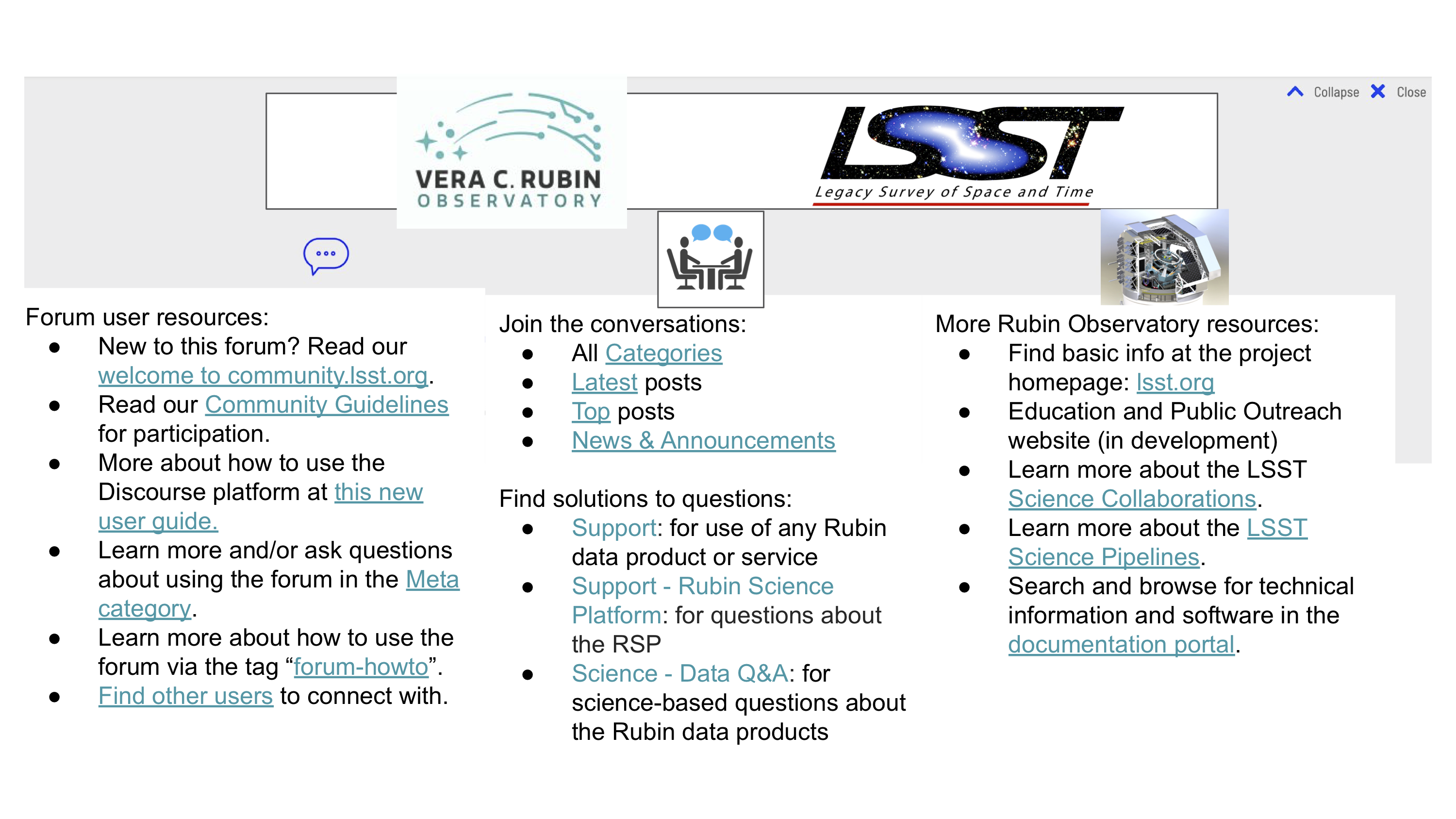
In response to comments on my previous post proposing updates to the banner to appear at the top of the forum, I offer here an updated mock-up of some ideas. Again, this is not meant to illustrate the visual aspects – we will have people with some expertise in graphic design implement that. This mock-up is to share ideas about the contents and usability of the proposed banner.
Your thoughts, comments, and suggestions are welcome. Otherwise, look for this new feature appearing soon! As before, you’ll need to open/download the PDF to get links that work: CLO_banner_mockup_v2.pdf (945.3 KB)
The mock-up is linking to a lot of stuff. Personally I would find that overwhelming and hard to process. If that could be cut down to at most seven things across all categories, I think it would be less intimidating and a bit easier for users to understand.
That may require doing fan-out at a lower level. For example, there are multiple entries here that are primarily of use to new users (new to the forum, community guidelines, how to use Discourse, etc.) that could potentially be collected into a new user page with a single link in the banner.
In general I’m wondering if we can shorten the text in each bullet and still have it make sense. Proposals below. But perhaps in the real formatting there will be more space per line.
I added a placeholder for the user tutorial post that @ChristinaAdair and I are working on.
I think “Find other users to connect with” might fit better under “Join the conversation”? Also perhaps we could add the EDI category to “Join the conversations”…
In addition to shortening bullet text, there are a few more categories we could highlight in the “solutions to questions” list? Example below.
I’d also like to add some kind of mission statement or catch phrase in a central area banner, like:
“This Community Forum is the main portal for community engagement and crowd-sourced support for science with the Rubin Observatory data products and services. Everyone is welcome to browse the contents, ask questions, share knowledge, and discuss topics related to Rubin Observatory and the Legacy Survey of Space and Time (LSST).”
Just to add another option for the “global” links: a new theme could put a navigation bar across the top of the site (i.e., above or below the Discourse menu bar). Ideally, that navbar would be similar to, if not identical, to the navigation bars we have or will be putting on our other web properties, from www.lsst.org to www.lsst.io, to individual documentation sites, to the science platform homepage. That approach might give more consistency, and also reduce the amount of information that needs to go into the forum banner.
@jsick that sounds like a great idea – we can easily revise the layout and content of the banner to fit into a theme. Changes that make Community.lsst.org more visually similar to the other Rubin websites would be helpful too.
Yes, I agree - great idea, Jonathan! I haven’t looked at other Discourse themes, but have looked at a look of forums, and haven’t seen much in the way of navigation bars on many of them. That would help accomplish the goals of including a banner, and reduce clutter (and if we can make it more consistent with the visual identity in general, that’s fantastic!).